電商從0到1,一個二十歲創業成功的CEO,以自身經歷編寫的電子商務教程。強調網路思維和市場實務的碰撞,提供關於投放廣告、鎖定客群及品牌定位的基礎知識,可以說是新一代創業的策略指南。
E-Commerce Zero to One is an e-commerce manual written by a successful twenty-year-old entrepreneur. Learning from his own experience, the content ranges from running advertisement, targeting customers to brand positioning, which makes a perfect strategic guideline for young blood to start a business.
---
整體視覺計畫,以字符與幾何圖形互相搭配,既使資訊類的文字閱讀清爽,也讓內頁圖表清楚而富有細節。圖文編排與教學內容相輔相成,雖是較為嚴肅的課題,卻不失活潑的觀點。
以Zero to One為基底、英文字母解構所組成的符號如同一張對話中的臉譜,顏文字的視覺呈現,帶出電子資訊的時代感。另一方面,圓圈與線段的組合,重構了「0」和「1」的意象,也藉由圖形交疊、填色、比例分配的暗喻,導引出商務化、數據化的精準表現。
In the process of visual planning, the creator used characters and geometric shapes as basic elements, making legible content and detailed charts by putting all elements well together. The layout and composition were mutually complementary to the learning material, which highlighted some interesting point of view from serious topics.
English letters were deconstructed and recomposed in the form of zero to one, which resembled a face-to-face conversation. An emoji-like image brought out a sense of digitality. On the other hand, the collocation of circles and line segments reformed the imagery of “0” and “1”. The idea of accuracy in commercialization and digitization was conveyed in the expression of overlapping, filling and allocating images.
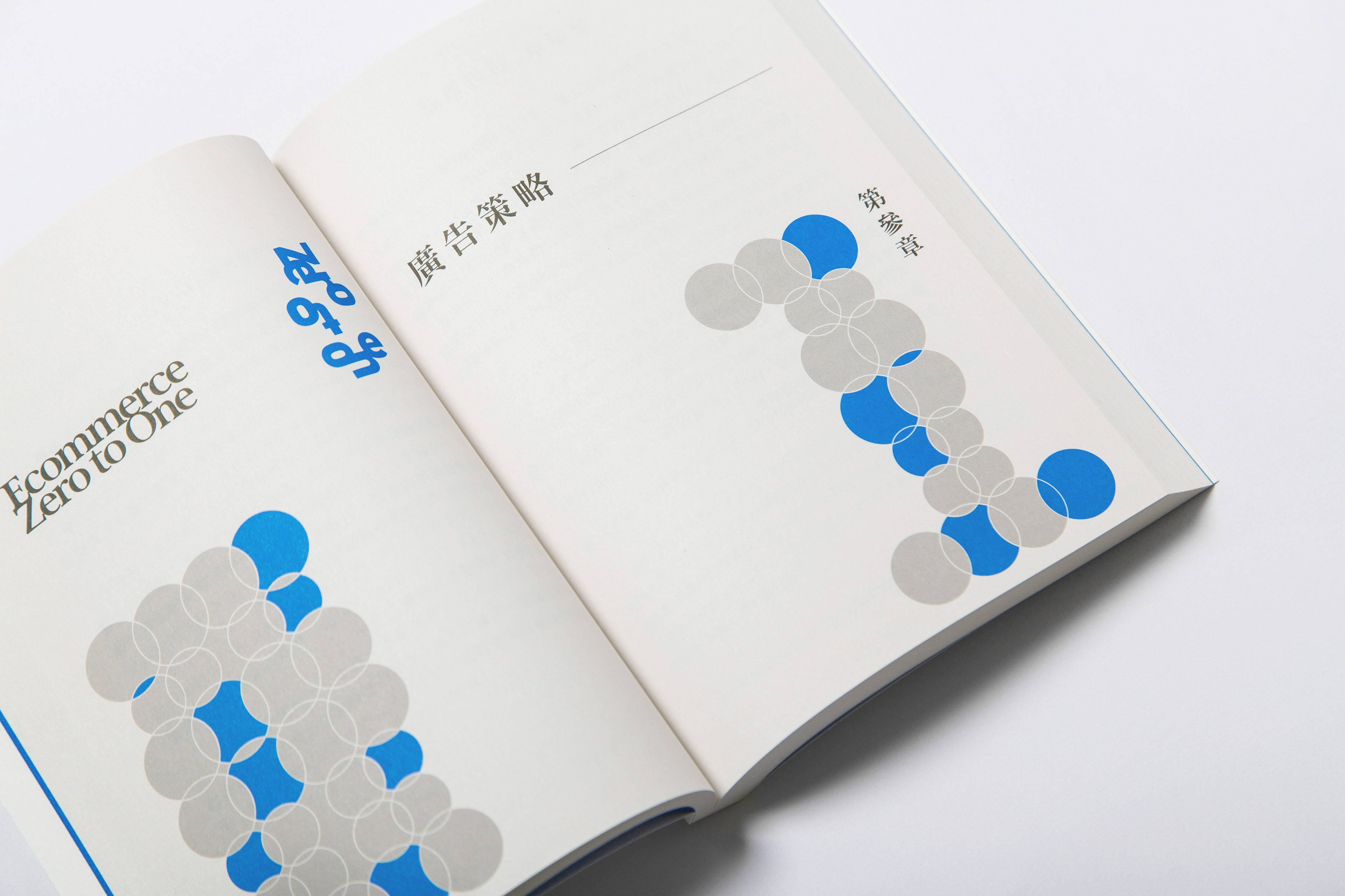
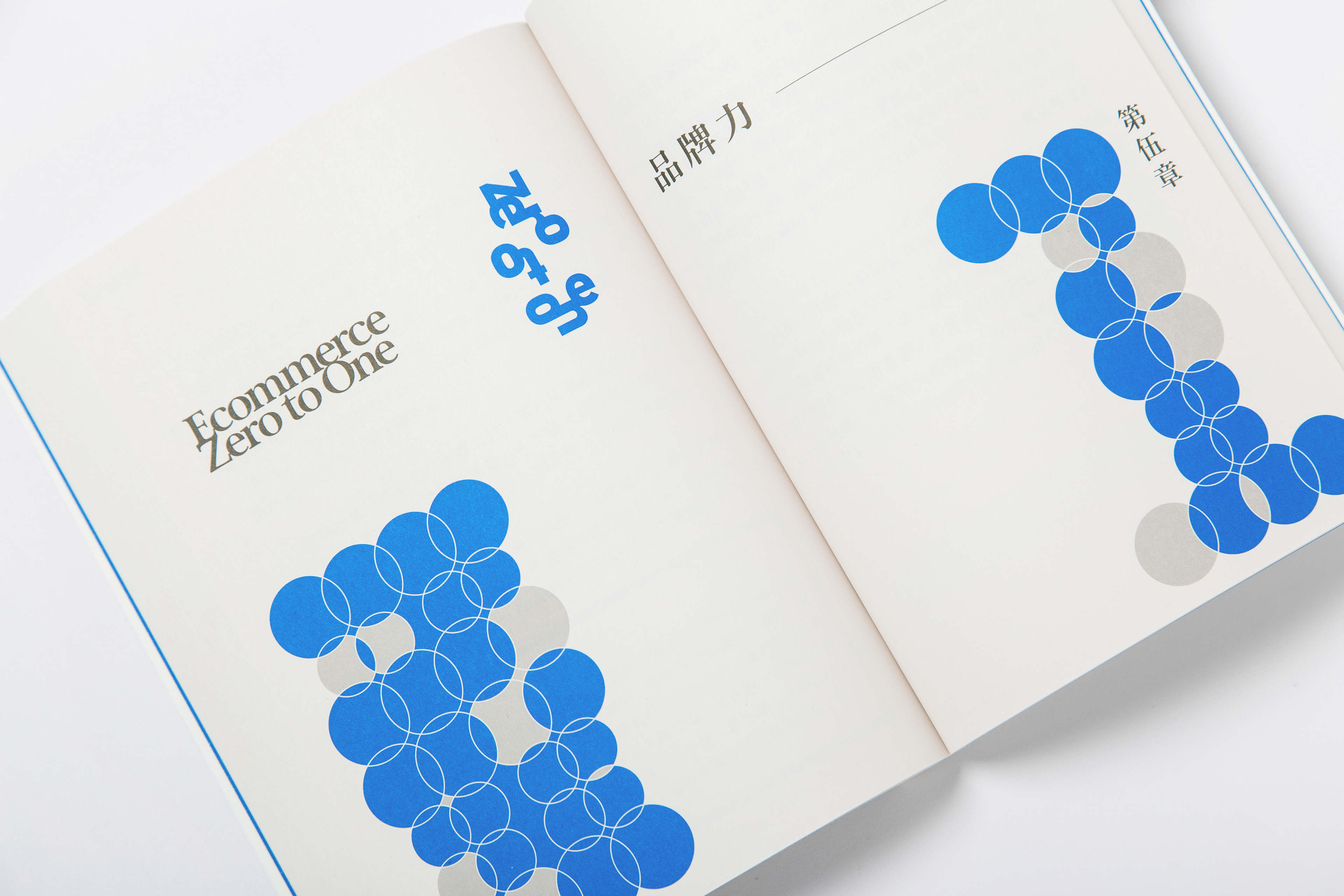
封面與單元頁面,以「0」轉化而成的幾何圓構築出數字「1」的輪廓,將視覺緊扣書名內涵,直指核心。「0」的交疊與填色暗指交集、聯集、差集與互斥的概念,恰恰呼應了商用資訊圖表的基礎表現形式,而線段穿梭其中,更起到說明與視覺平衡的作用。
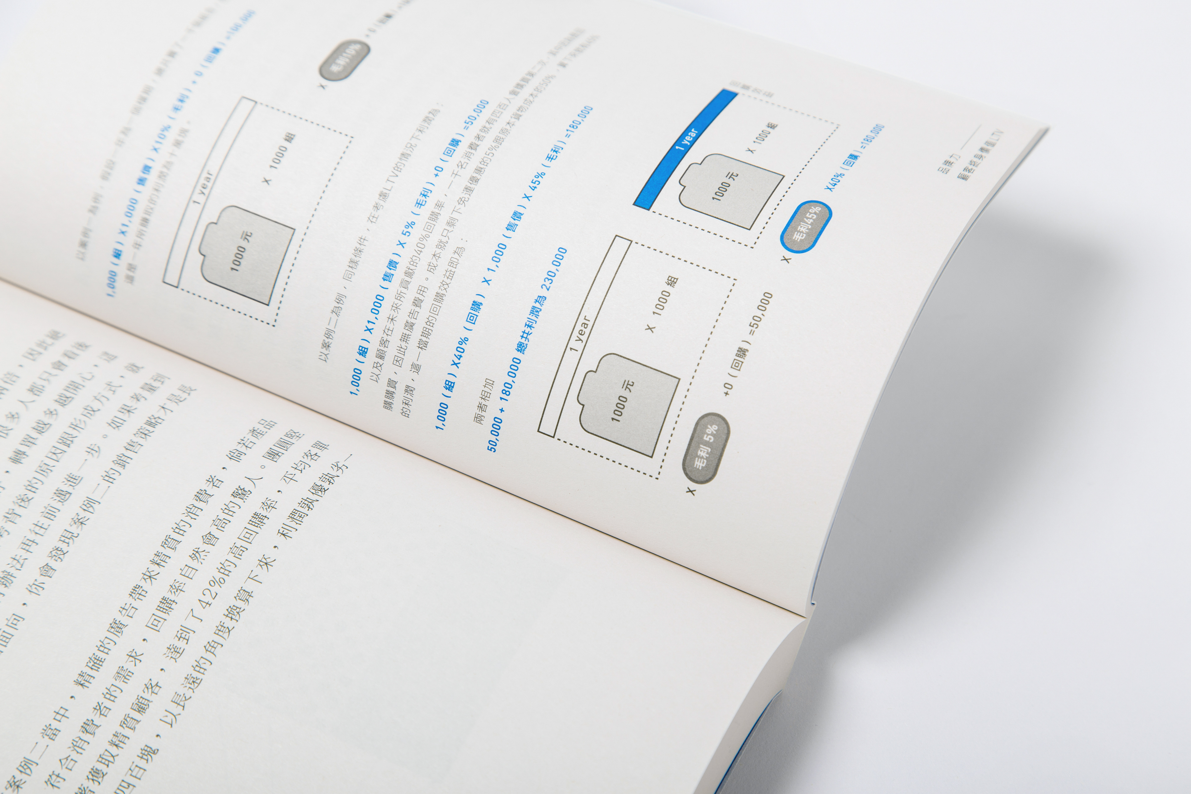
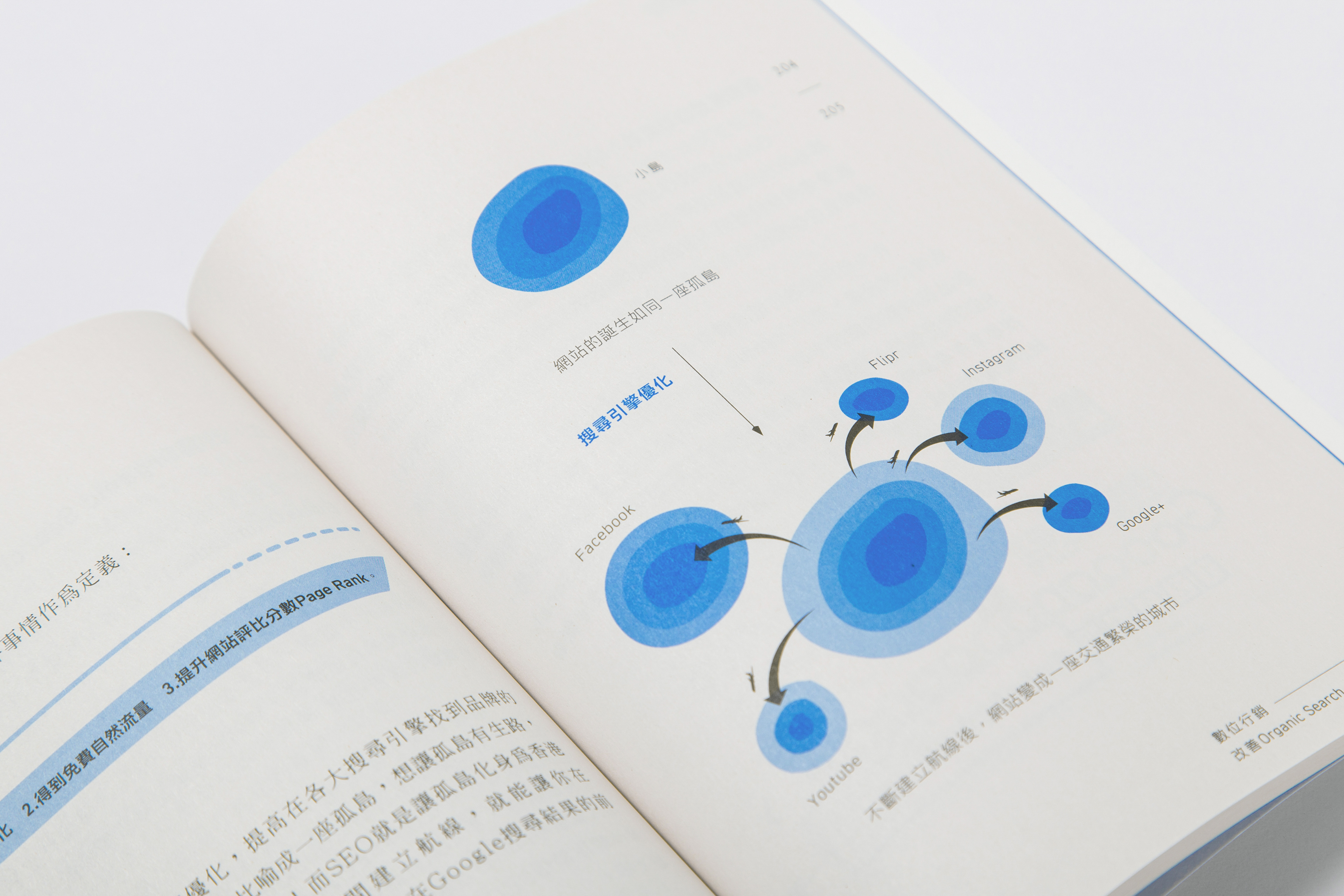
幾何元素的組合進一步延伸至內頁排列與圖表繪製,另以特別色輔助標示重點,彷彿閱讀中的呼吸與美好的風景,更使人加強記憶。個別頁面的圖文編排主其精而不貴多,在內容豐富的主體資訊之外,也提高了學習的興趣與成就感。
幾何元素的組合進一步延伸至內頁排列與圖表繪製,另以特別色輔助標示重點,彷彿閱讀中的呼吸與美好的風景,更使人加強記憶。個別頁面的圖文編排主其精而不貴多,在內容豐富的主體資訊之外,也提高了學習的興趣與成就感。
As for its cover and each chapter, “0” was transformed into a geometric shape in order to construct the outline of “1”, connecting the visual concept to the title. The overlapping and filling of the images referred to the concept of the intersection, union, difference set and mutual exclusion, correlating the basic composition of infographic design. Also, the graphic was well balanced with the line segments within.
Geometric elements were seamlessly blended into layout and charts of inner pages, along with highlight key points by using spot color. Besides, each page was delicately arranged to demonstrate the richness of knowledge. Just like unforgettable scenery, the composition made information more readable, enhancing the interest of learning and sense of achievement as well.


《電商Zero to One:從0到1》
Graphic Designer / 朱俊達 Chu Chun-Ta
Photographer / 黃詮順 Chuan-Shun Huang https://www.58kg58kg.com/
Client / 劉家昇Samuel Liu
Client / 劉家昇Samuel Liu
博客來購買 http://bit.ly/2AenJHZ