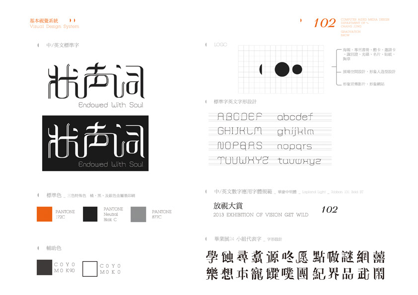
Visual Design_ 朱俊達 Chu Chun-Ta | 林宜靜 Lin Yi-Ching
Exhibition Design_ 蘇信瑋 Su Hsin-Wei | 蘇家鋆 Su Chia-Yun
Web Design_ 龔雅婷 Kung Ya-Ting
Motion Graphics_ 林思翰 Lin Sih-Han
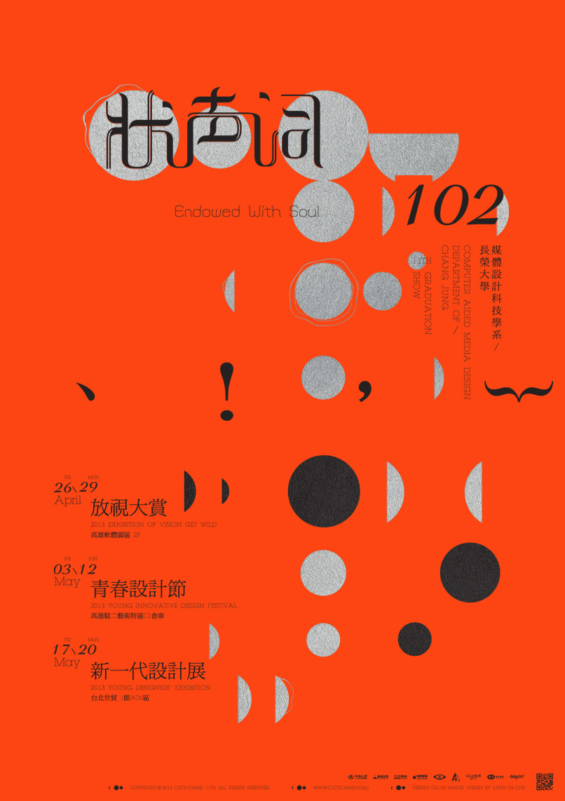
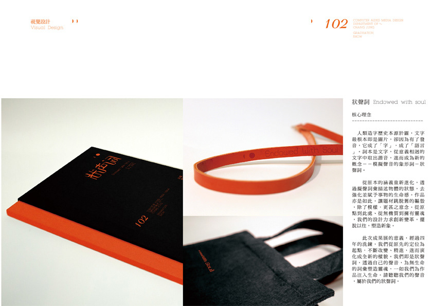
人類造字歷史本源於圖,文字最根本即是圖片,卻因為有了發音,它成了「字」,成了「語言」。詞本是文字,從意義相迥的文字中取出諧音,進而成為新的概念--模擬聲音的象形詞-狀聲詞。
從原本的涵義重新進化,透過擬聲詞彙描述物體的狀態,去強化並賦予事物的生命感。作品亦是如此,讓題材跳脫舊的軀殼,除了模樣,更甚之意念。從原點到此處、從無機質到擁有靈魂,我們的設計力求創新變革,擺脫以往,塑造新象。
此次成果展的意義,經過四年的洗鍊,我們從原先的定位為起點,不斷改變、精進,進而演化成全新的樣貌。我們即是狀聲詞,透過自己的聲音,為無生命的詞彙塑造靈魂,一如我們為作品注入生命。請聽聽我們的聲音,屬於我們的狀聲詞。
The history of the letter made by human and it comes from pictures. The letter is originally from the pictures. Because of its pronunciation, it becomes words and language.
The word was originated from the letter. It takes homonym out of the different meanings of letter, and then becomes a new conception. Onomatopoeia is a kind of pictograph which simulates the sounds.
From originated meanings to reform, through a word that refers to its own meaning through its sound to describe a condition of the subject. We use it to enhance and give it alive. Production is doing so; we use different subject matter to reform. Besides, there are some changes from the new design and the new meanings. From the origin to here, from inorganic to have a soul, our designs try hard to innovate and reform a new imagery.
The meaning of the Graduation Exhibition is, through this four years, we starts from the originally location and keep changing, improvement. And then, develop a new design. We are onomatopoeia. We use our voice to create for the inanimate words to have a soul, just like we make our production to be alive. Please listen to us, the only for our onomatopoeia.

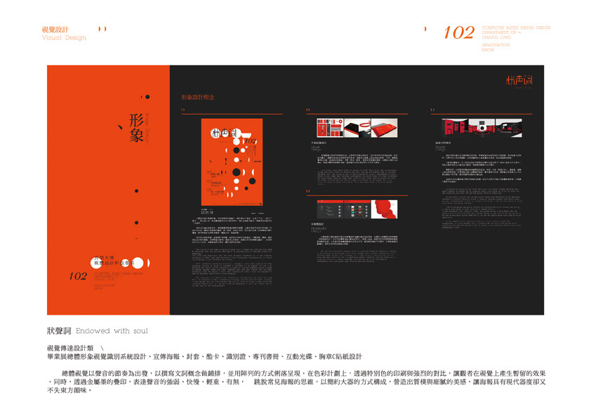
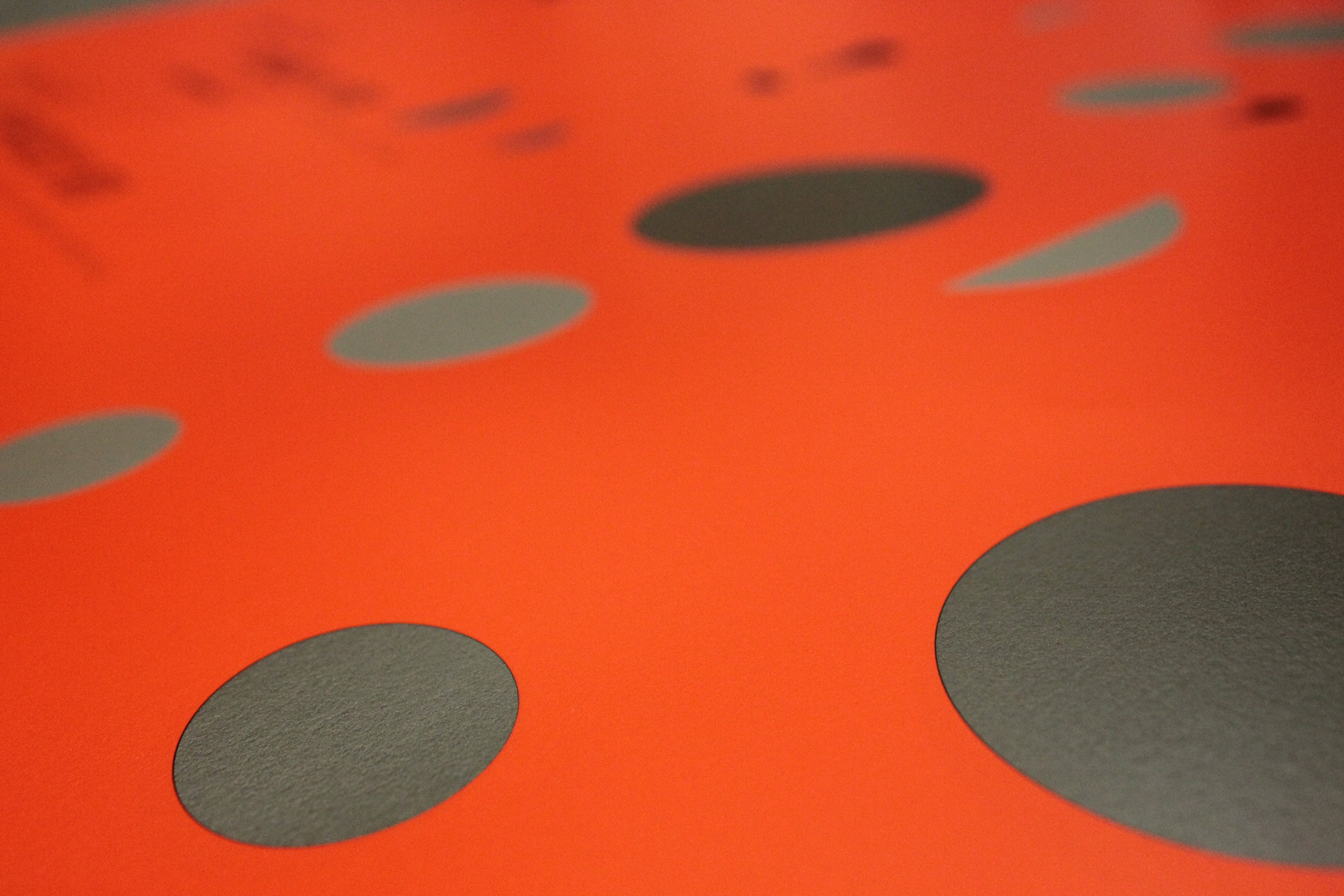
總體視覺以聲音的節奏為出發,以撰寫文詞概念做鋪排,並用陣列的方式俐落呈現。在色彩計劃上,透過特別色的印刷與強烈的對比,讓觀者在視覺上產生暫留的效果。同時,透過金屬墨的疊印,表達聲音的強弱、快慢、輕重、有無, 跳脫常見海報的思維,以簡約大器的方式構成,營造出質樸與細膩的美感,讓海報具有現代器度卻又不失東方韻味。
The whole vision starts from the temple of voice. Then write some meaningful words and show others by array.In the color, we use the special color to contrast between print and strong. It can let the audience to make a persistence of vision effect. At the same time, through superimpose the metal color, we want to express the voice from strong to weak, from quick to slow, from light to weight. We form by simple method and use different kind of thinking on the poster. We try to make the sense of plain and smooth. To let the poster have a kind of modern beauty.
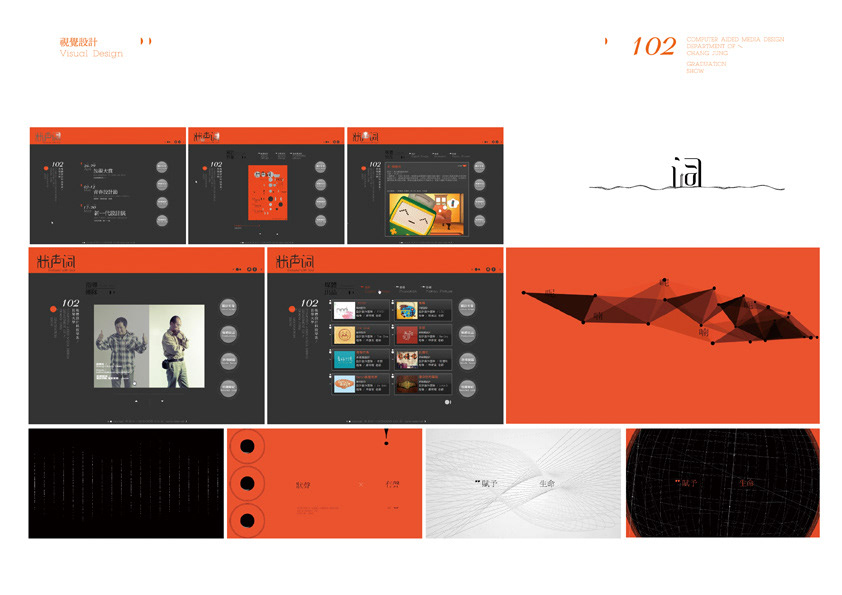
以畢業展主題海報所呈現之總體意象作為網站創新設計發想,故選用主視覺顏色搭配動態,形成頁面設計,各子頁的聲形波紋(聲音的形狀)
動態主按鈕,搭配子頁的簡潔動態按鈕操形成操作介面,以及運用影像轉場跳換方式至各子頁,讓簡潔的網站不失層次,完整的展覽相關資訊,獲得充分的閱讀與展示效果。
We use the graduation display poster to show an image to innovate a design of the website, so we choose main visual design color to match movement. Then, it becomes page design. Each subpage has its own shape of voice which use the easy dynamic button to form an operating system interface and we make use of videoing transitions to each subpage. The website can show the relative information about exhibition and acquire sufficient showing.
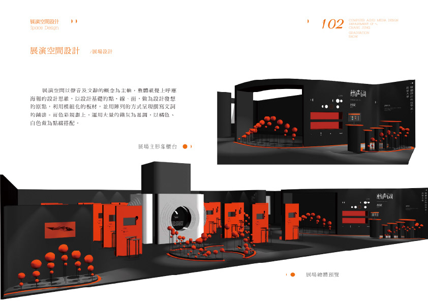
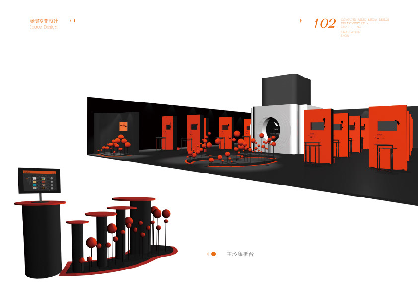
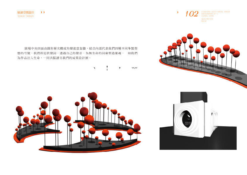
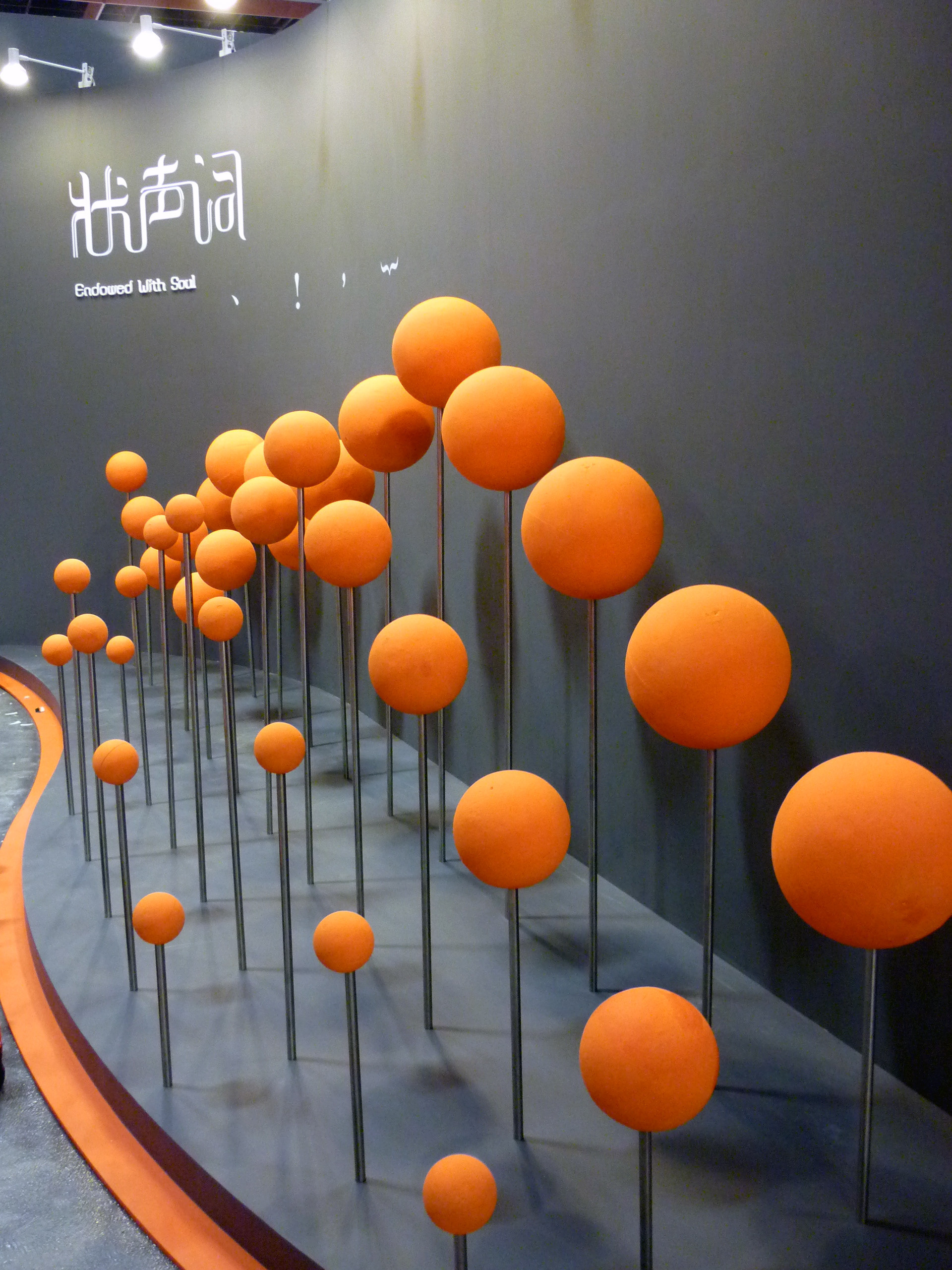
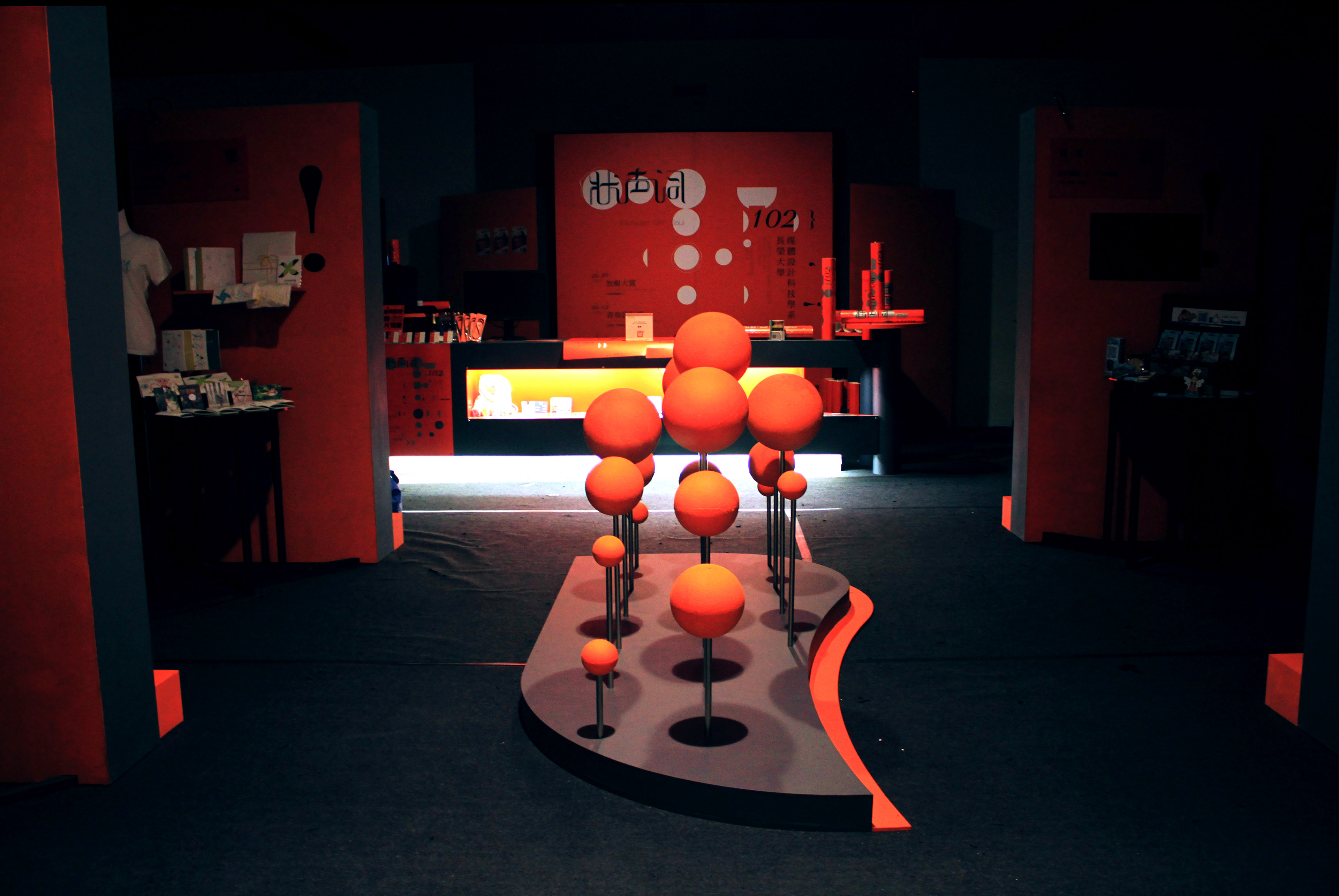
展演空間以聲音及文辭的概念為主軸,整體視覺以海報的設計意象發展,利用模組化的板材,用陣列的方式呈現鋪排。色彩規劃,運用大量的鐵灰為基調,以主視覺顏色搭配。
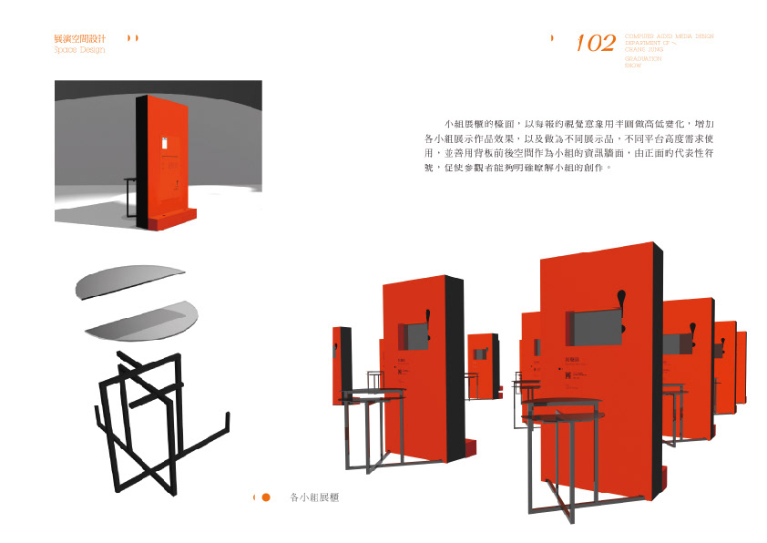
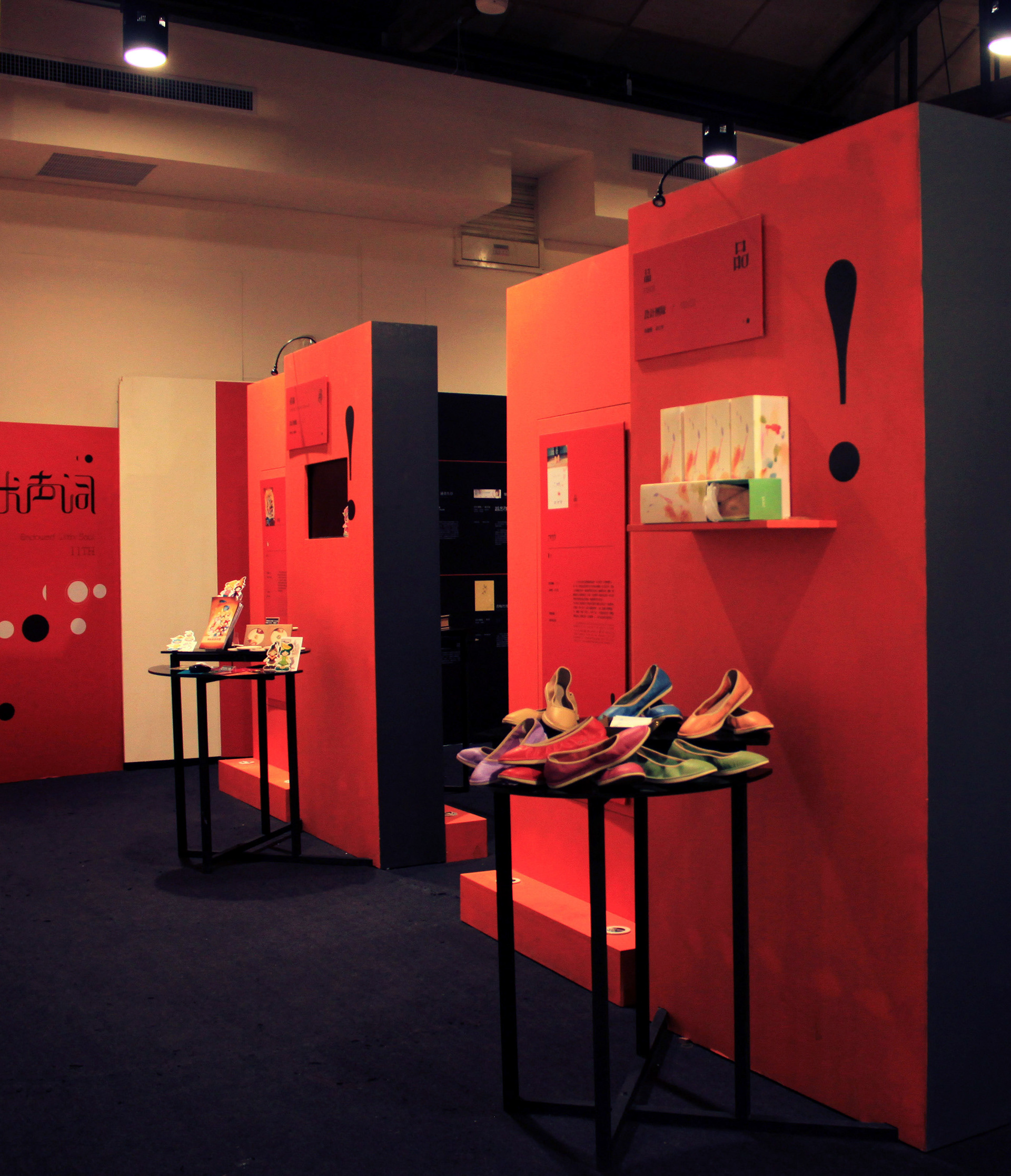
小組的展櫃檯面,以主視覺意象用半圓做高低變化依需求使用,增加小組展示作品效果,背板前後空間作為小組的資訊牆面,使參觀者瞭解小組的創作。
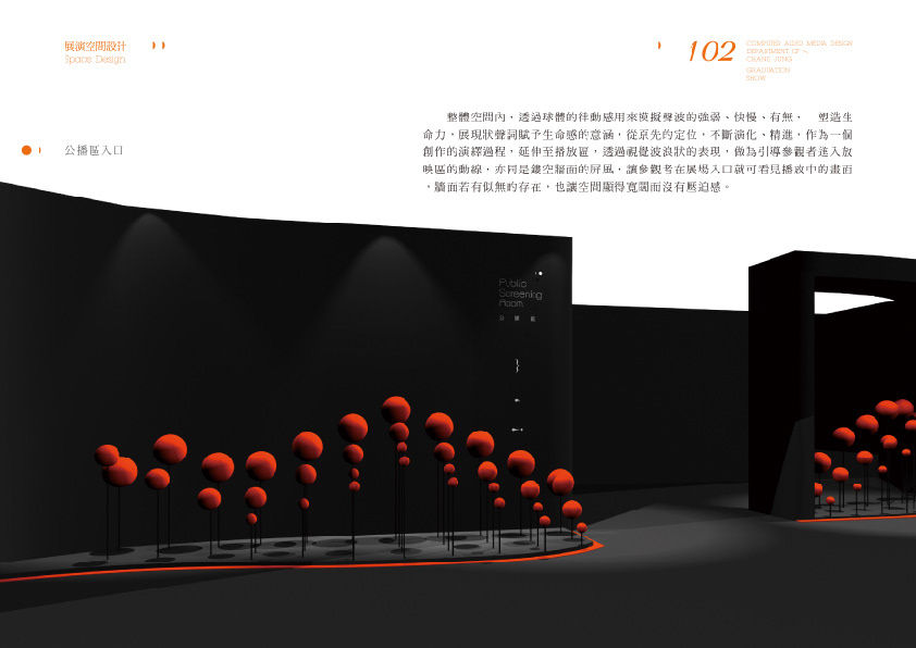
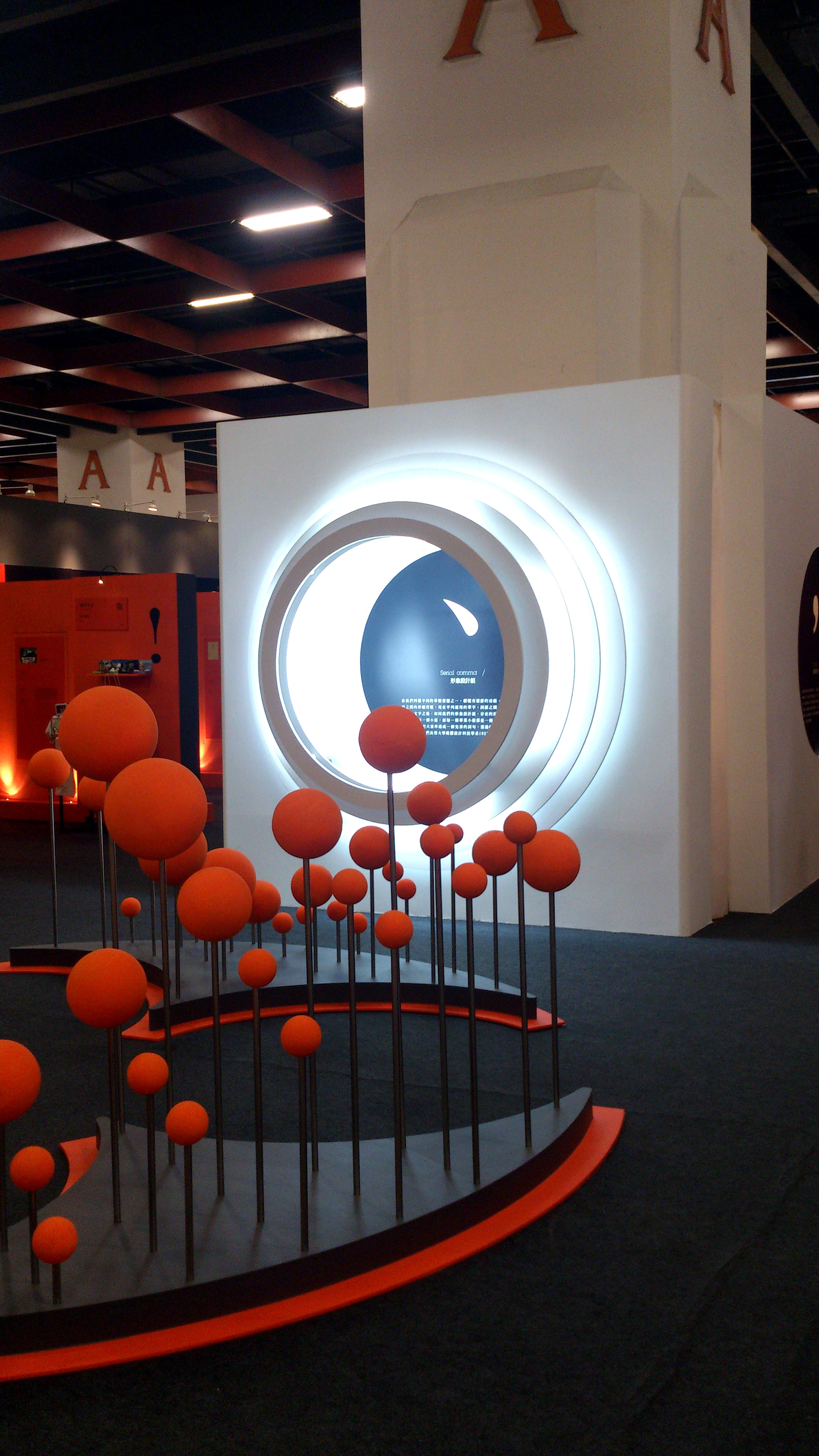
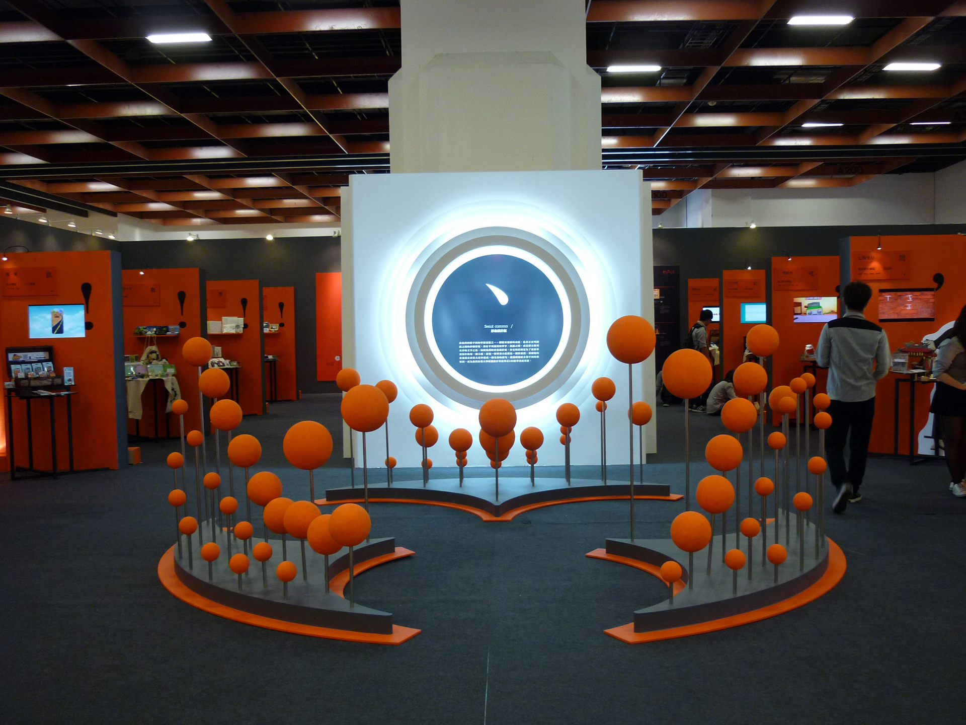
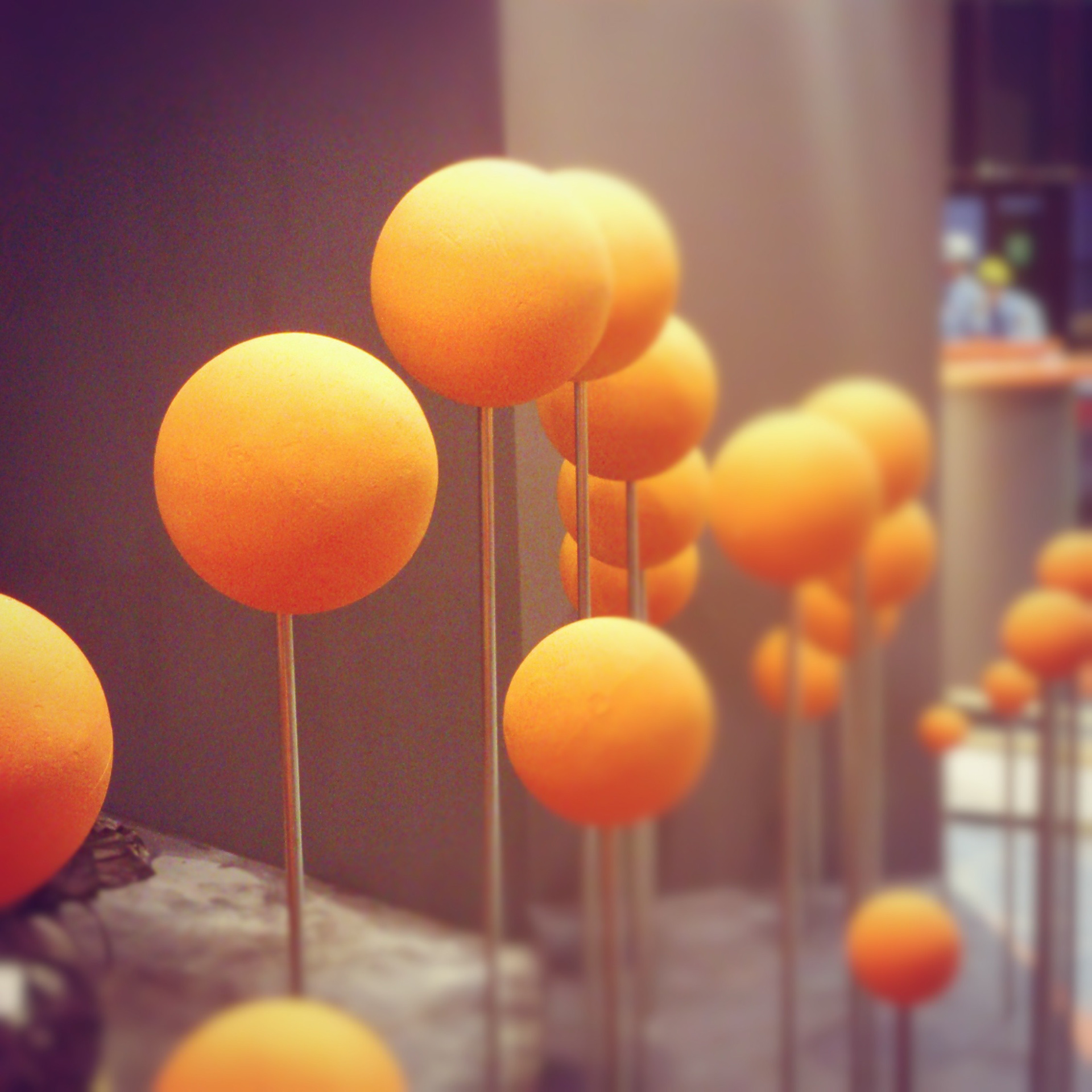
整體空間,以球體的律動感來模擬聲波的強弱、快慢、有無,塑造生命力,播放區,視覺上波浪狀的表現,引導參觀者進入放映區的動線,鏤空牆面的屏風,讓參觀者在展場入口可以看見播放中的畫面,讓空間顯得寬闊沒有壓迫;展場中央四面圓形層次構成的聲波意象牆,結合代表我們四種不同整體視覺符號,共振譜出我們的成果展。
The space is based on the voice and word. The whole visions develop from poster design. We make use of modular board to arrange by array. In color, we are based on iron-gray. We use the major vision to match up.
In our group counter, we use the major vision and semicircle to do different variation to different kind of needs. In order to increase group’s exhibition effect, we use the backboard to add our group information. It can let the visitors to know more about our group creation.
The whole space use global rhythm to simulate the sound wave from strong to weak, from quick to slow, and try to create vitality.In the broadcast area, with our vision, we guide visitors to broadcast area by using wavy to show you. We use a screen which is dug wall to let the visitors to see the appearance in the entrance. It can let the space more wide and have no oppression.In the middle of the exhibition, there is a wall which is called the imagination of global rhythm that is formed with the four circle gradation. It combines with our four different sign of whole vision, and then become our study performance show.
Awards
Communication Arts Typography 2018 - Finalist
TYPE + TEXT | Poland/China International Exhibition of Typography Posters 2016 – Selected
Communication Arts Typography 2018 - Finalist
TYPE + TEXT | Poland/China International Exhibition of Typography Posters 2016 – Selected
Biennial of Poster Bolivia. BICeBe 2015 - Selected
ASIA PACIFIC DESIGN NO.10 - Selected
11 GOLDEN BEE GLOBAL BIENNALE MOSCOW 2014 - Selected
GDC13 Graphic Design in China 2013 - Selected
Young Designers' Exhibition 2013 Exhibition Space Design Competition - Bronze
Youth Innovative Design Festival 2013 Exhibition Space Design - Gold
The 2th Most Creative Talent Award Of Tainan 2013 - Finalist
Vision Get Wild Exhibition 2013 Competition Graphic 2013 - Selected
Vision Get Wild Exhibition 2013 Competition Multimedia 2013 - Selected
Vision Get Wild Exhibition 2013 Competition Lnter disciplinary - Selected
Vision Get Wild Exhibition 2013 Competition Exhibition - Finalist
-
Publish
《EXHIBITION ART Graphics and Space Design》- Sandu Publishing
《ASIA PACIFIC DESIGN NO.10》- Sandu Publishing
《PRINTING COLORS - CMYK & PMS》- Sandu Publishing
《CUTOUT》volume.07 issue.01
-
Publish
《EXHIBITION ART Graphics and Space Design》- Sandu Publishing
《ASIA PACIFIC DESIGN NO.10》- Sandu Publishing
《PRINTING COLORS - CMYK & PMS》- Sandu Publishing
《CUTOUT》volume.07 issue.01
超感輕塗紙
PANTONE 172C + PANTONE Neutral Black C + PANTONE 877C
PANTONE 172C + PANTONE Neutral Black C + PANTONE 877C