以剝開為設計主題,衍伸出兩套系列字體,並以海報方式呈現。
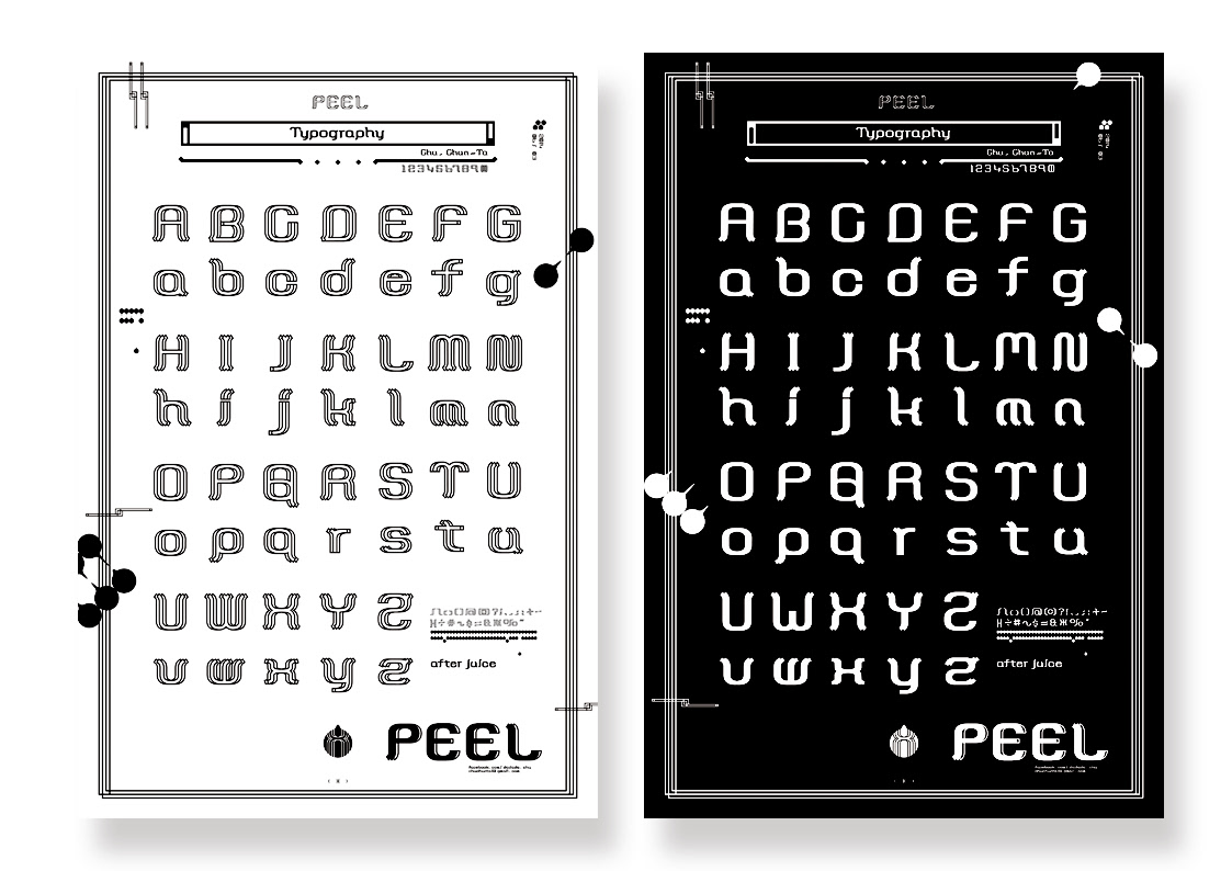
在「剝」的過程中,物體被層層撕開才會展現出最核心的樣貌,故以線條、手及一層層的概念做設計,搭配水滴及分子的意象圖形作為整體的視覺構成。
在「剝」的過程中,物體被層層撕開才會展現出最核心的樣貌,故以線條、手及一層層的概念做設計,搭配水滴及分子的意象圖形作為整體的視覺構成。
Two types of font are displayed in poster originated from the main idea “PEEL”.
Objects were peeled in order to show its “core value”. In this work, pattern of lines, fingers and layers accompanied with the images of water drop and molecule are combined to illustrate the concept mentioned above in the form of vision.
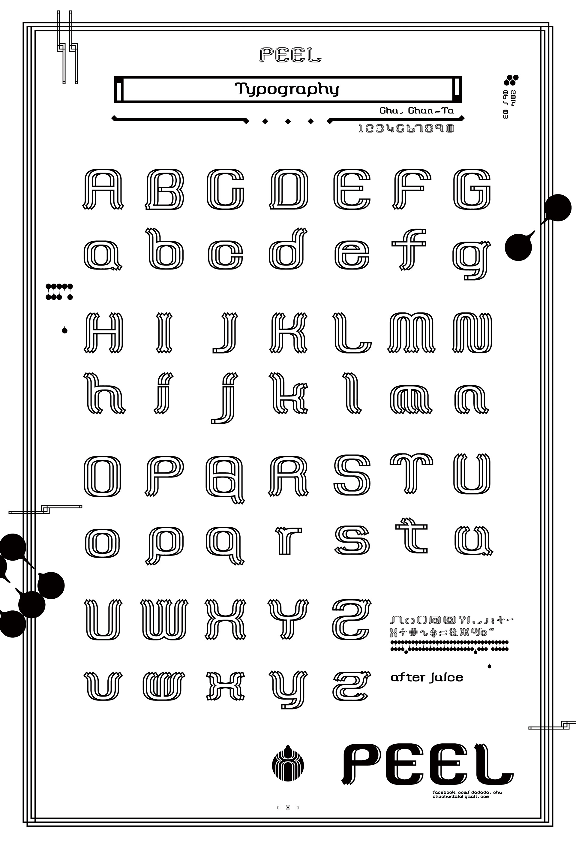
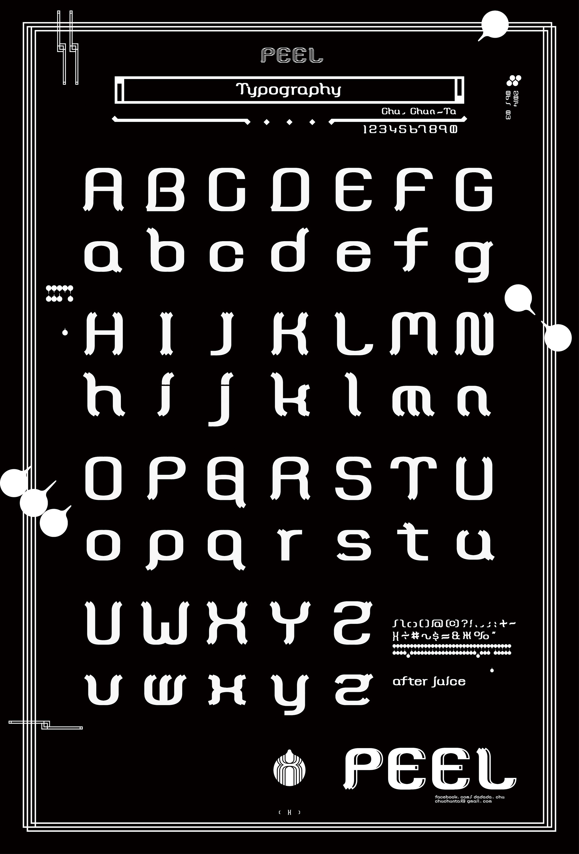
Typography _ PEEL
after juice.
after juice.
Awards
GDC15 Graphic Design in China 2015 - Selected
Publish
《Look at Me!-New Poster Design》- Sandu Publishing
《APPortfolio Asia Member》vol.5
《APPortfolio Asia Member》vol.5
《ASIA PACIFIC DESIGN NO.10》- Sandu Publishing
《CUTOUT 》volume.07 issue.01

