WO HENG ATTORNEY LAW
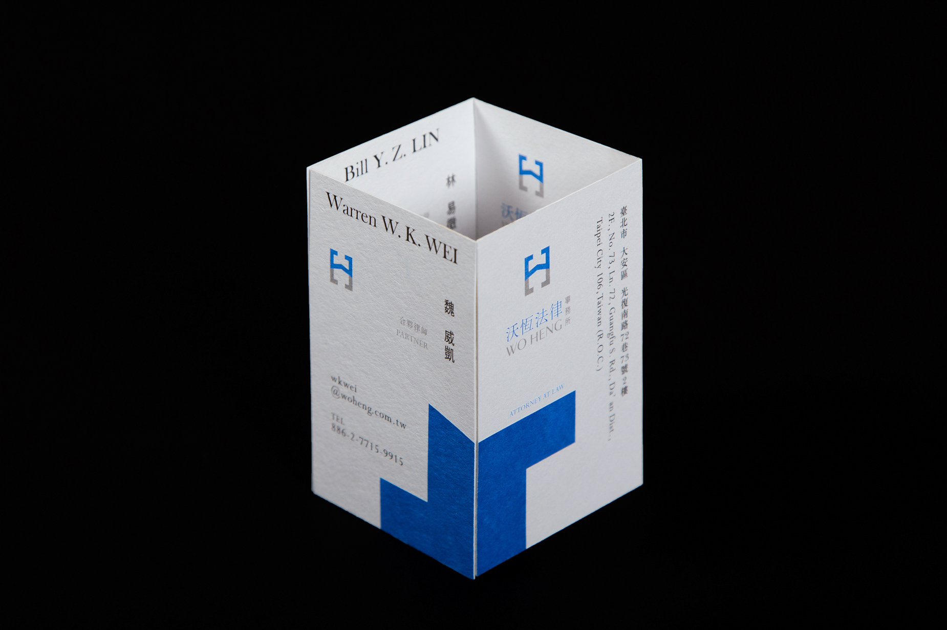
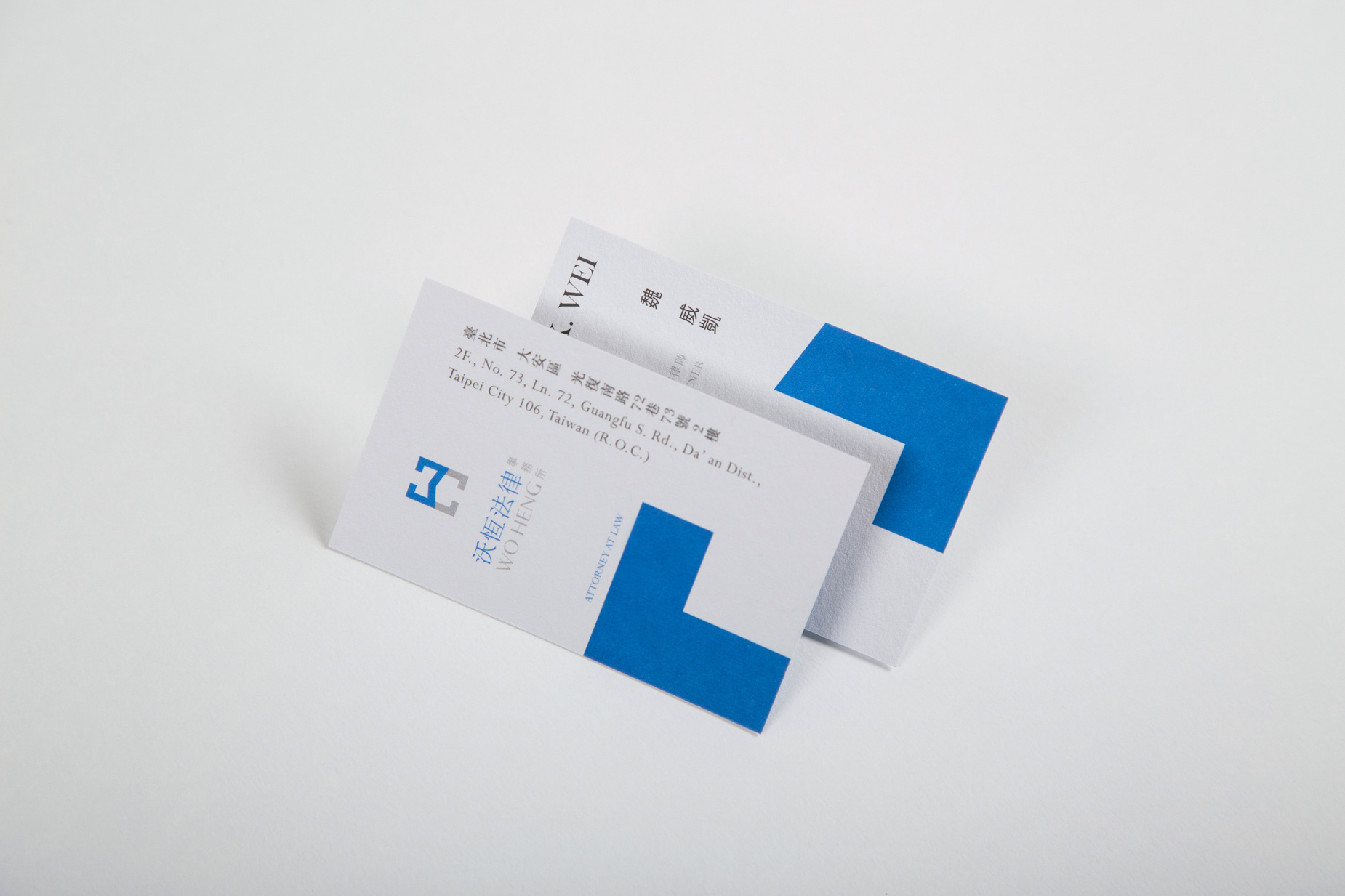
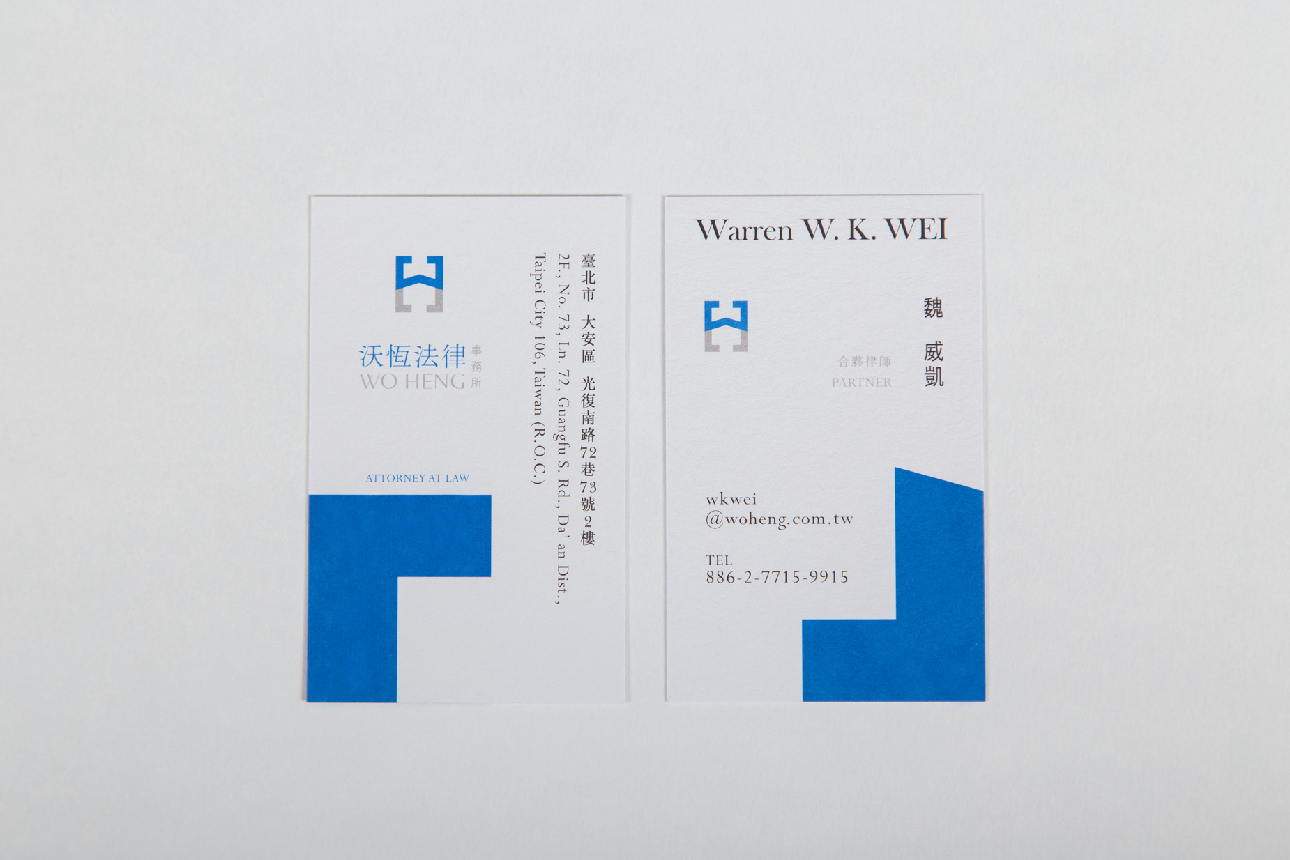
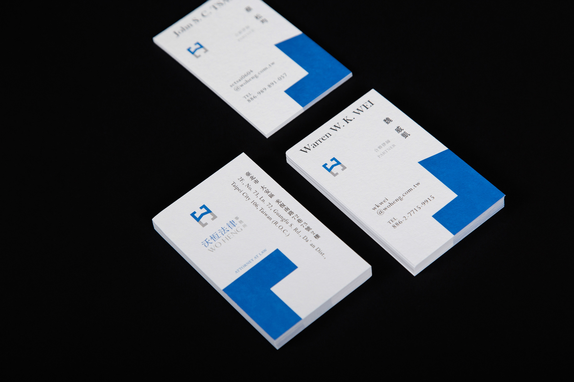
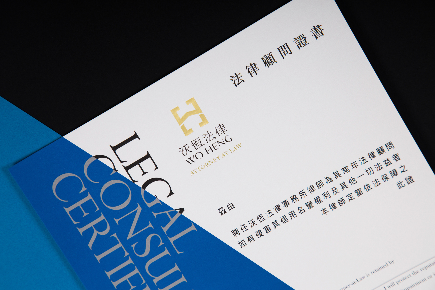
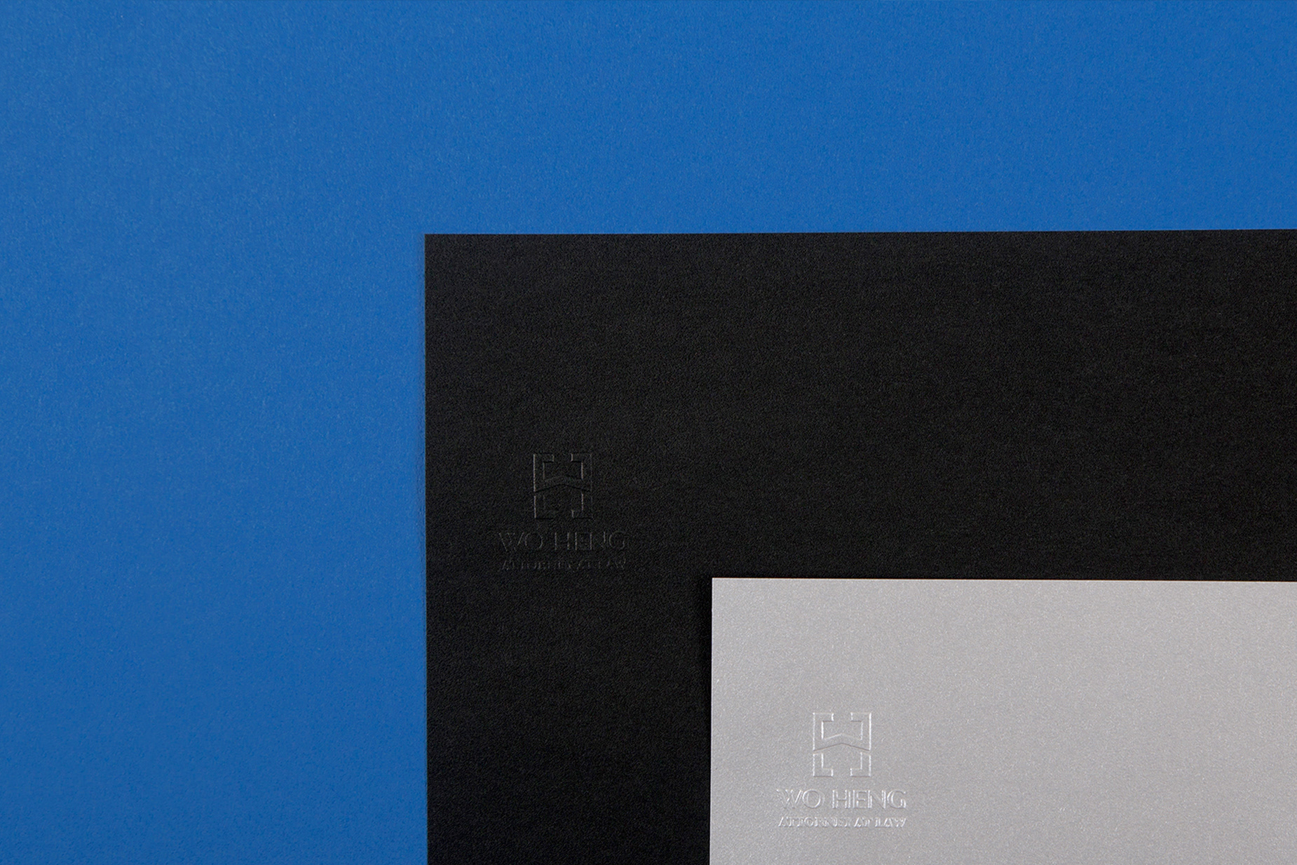
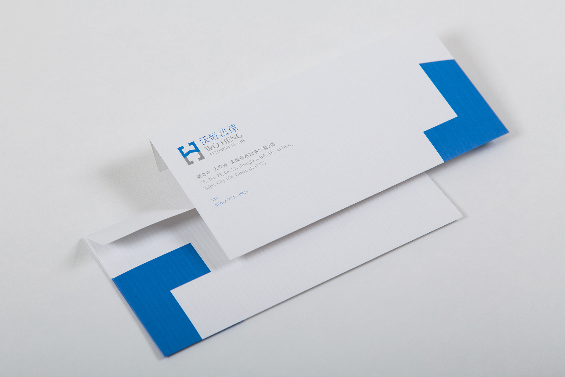
The logo evolution of the law firm is based on the core concept of contract and agreement. The rectangular elements are compared to paper contract. The English abbreviation of the rectangle is formed into a logo by splitting, and then a series of visual identification is extended. The concept of separation and combination is also carried out in this extended identification, aiming to show the subtle relationship between the disputing parties through the basic elements of the sign and the proportional relationship.


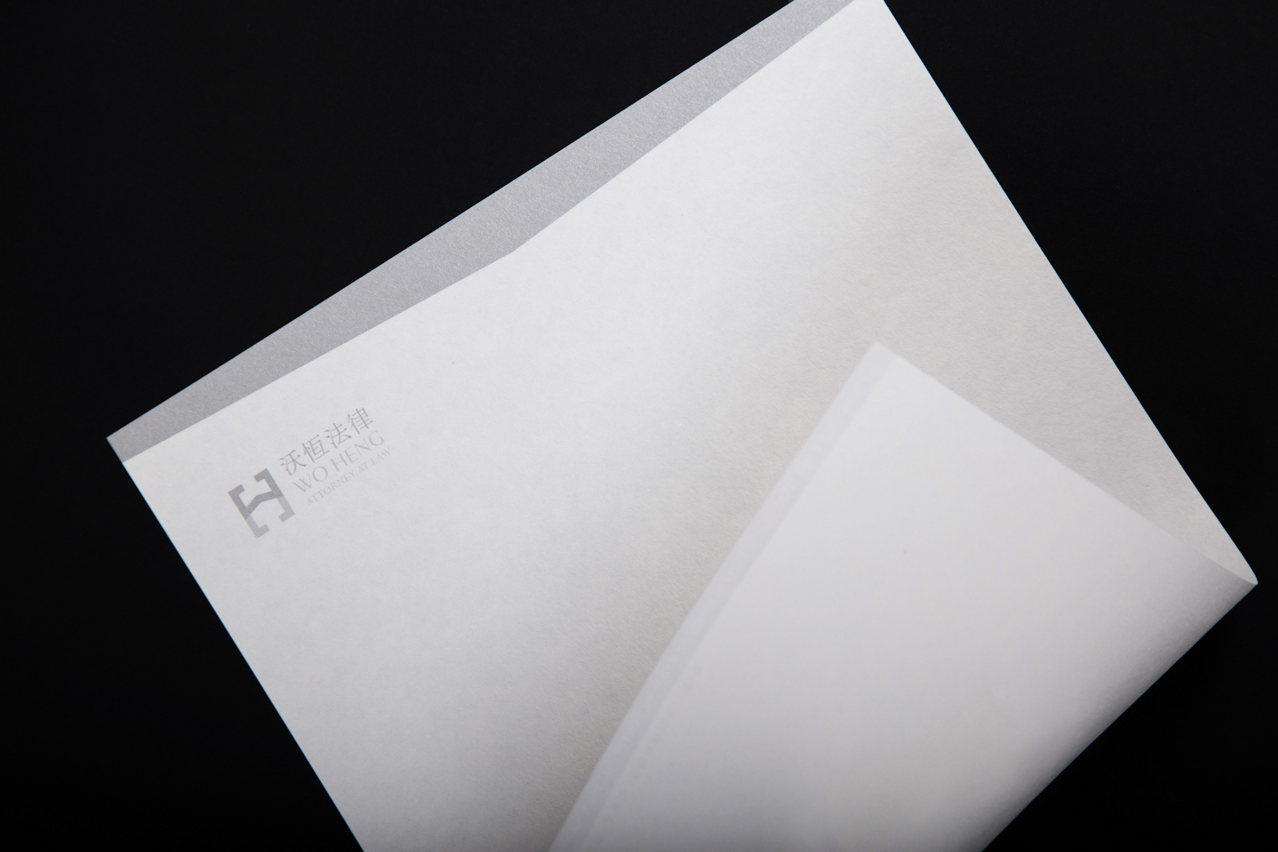
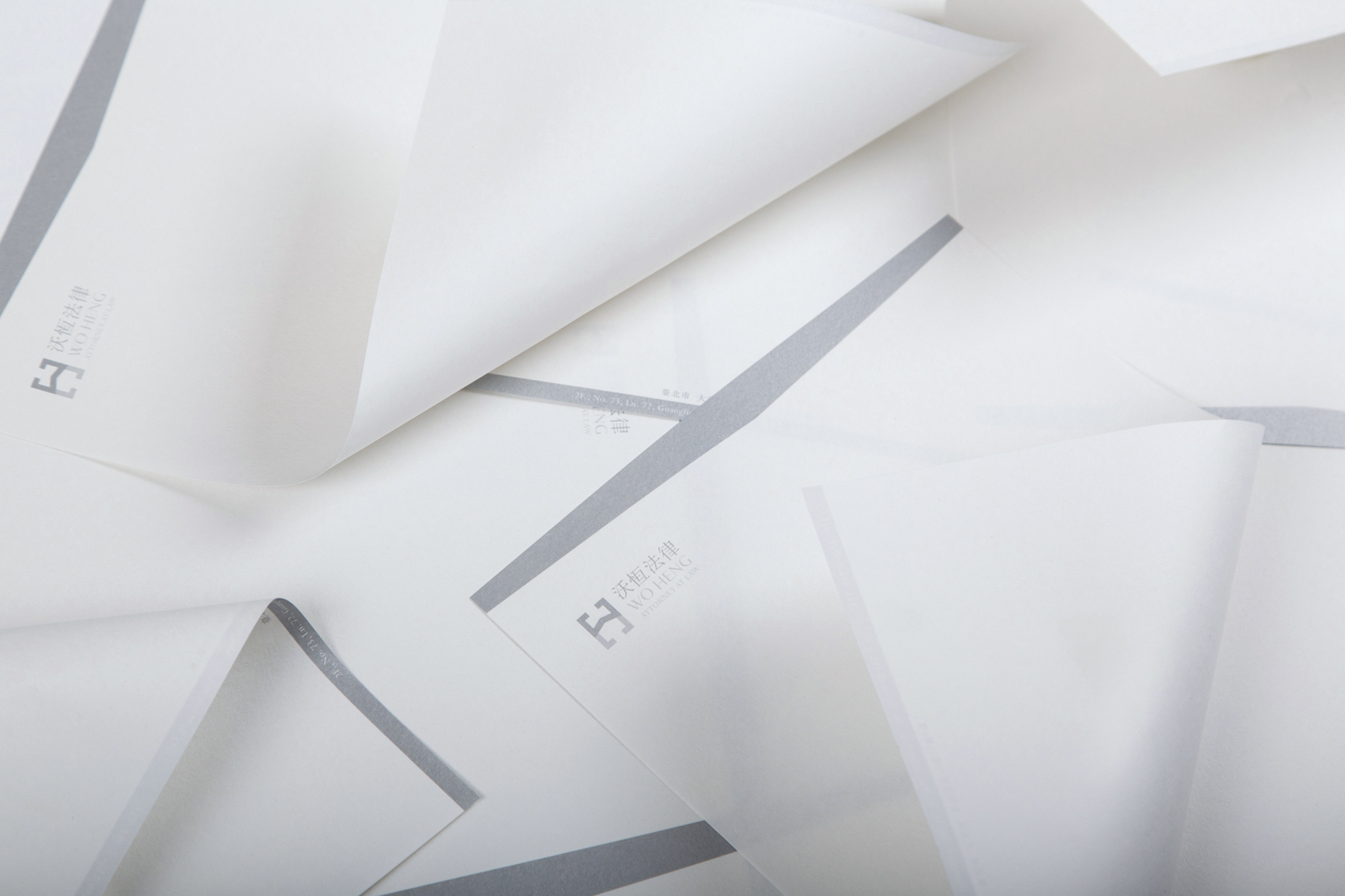
Designer / Chun-Ta Chu
Design Manager / Tsai Cheng-Yu
Photographer / Steven Chuan-Shun Huang
Print / WEI-YANG PRINT PLAN AGENT
Paper
business card /
Gmund - Heidi 長瑩紙業 - 海德堡紙
USED WHITE 再生白 330 g/m2
certificate /
Neenah - Crane’s Lettra聯美紙業 - 美國高級皇冠純棉紙
Fluorescent White 螢光白 120 g/m2
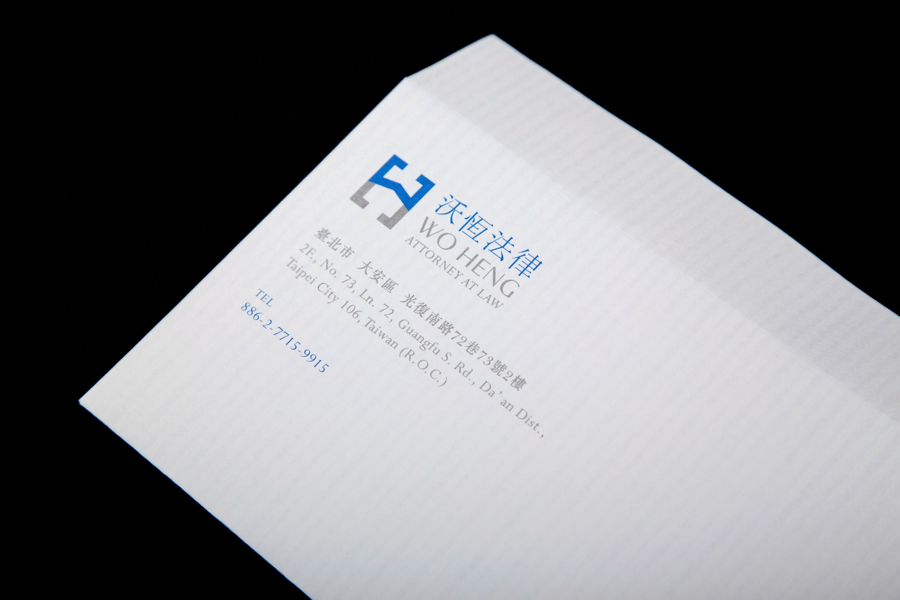
envelope /
Neenah - Classic Columns 聯美紙業 - 美國儷格紙
Recycled 100 Bright white 白118 g/m2
stationery /
采憶紙業 - 山彥奉書
92 g/m2